The graphics of Mirror's Edge.
Let's take a moment to appreciate those graphics:
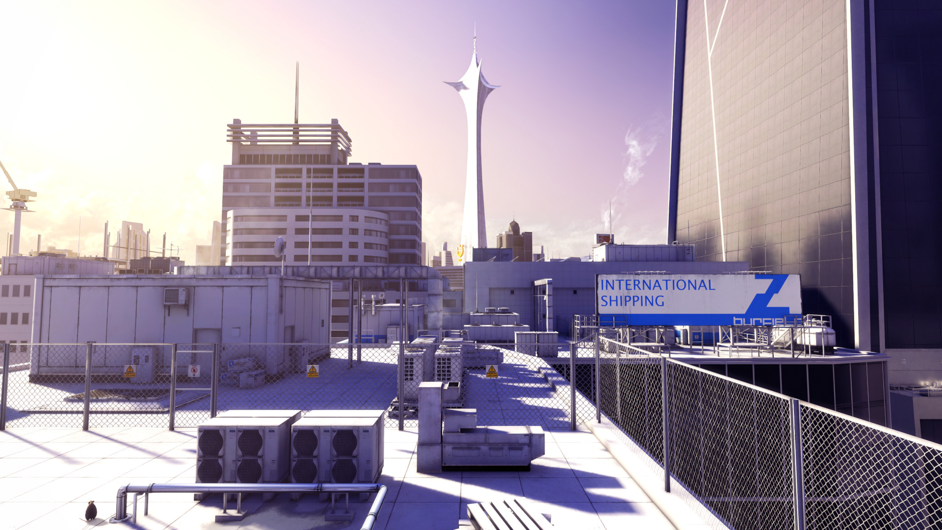
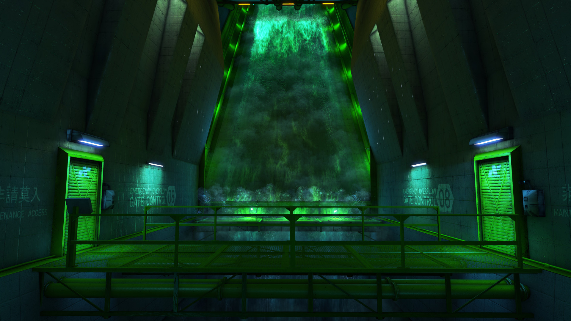
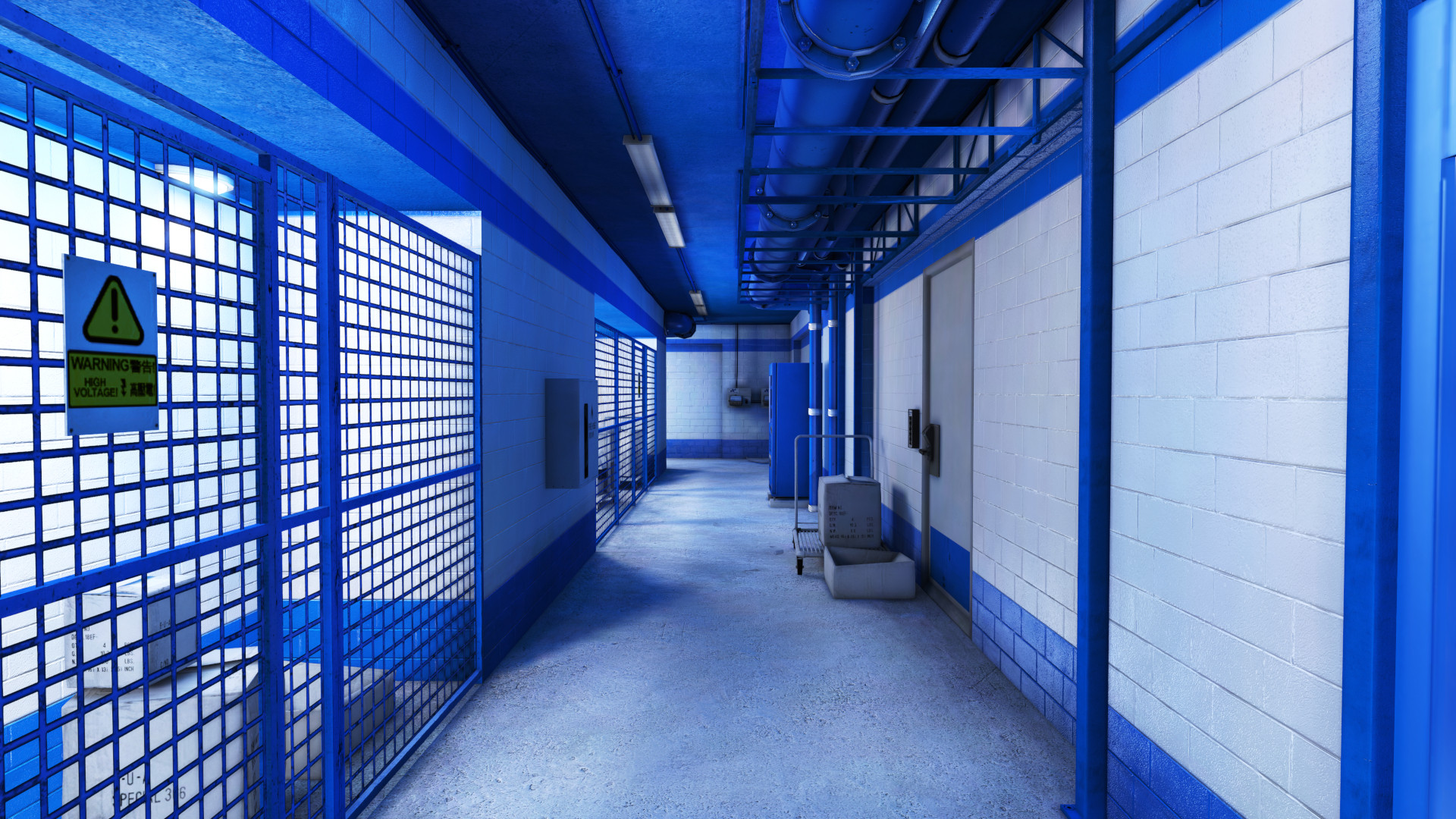
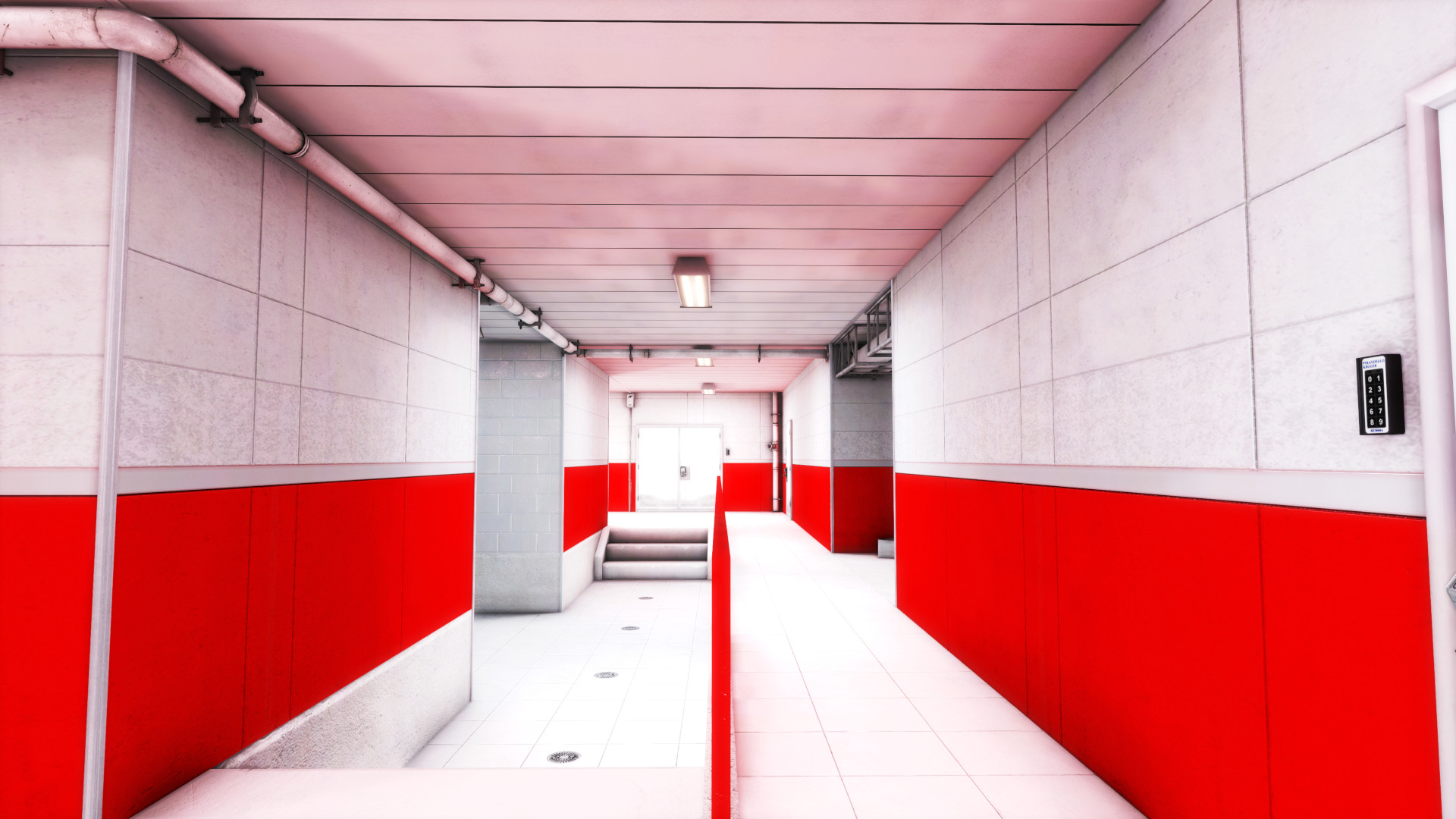
Mirror's Edge, released in 2008, looked like this. Such graphics still look good even today, 17 years later... But how?
The aesthetics
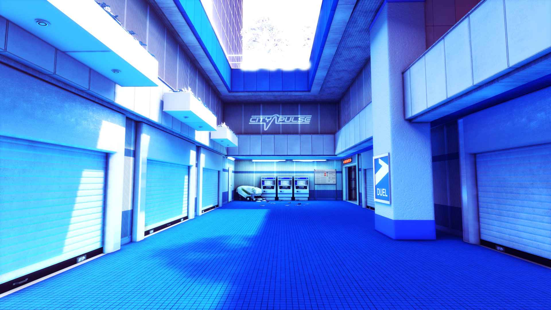
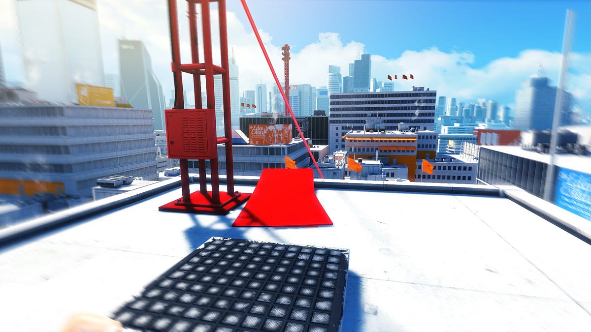
COLORS COLORS COLORS
Mirror's Edge didn't try to be realistic, but it followed its own set of rules for how things should look like. These aesthetics were nailed down well, DICE, the studio behind this game, executed this style brilliantly.
The world
a totalitarian society that values sterile conformity over individual freedom.
The environment is too clean, places are too minimal... Unsetteling yet calming. These facts help keep the integrity of the art style, design and gameplay pretty well.
The UI
there was no HUD, but there was runner's vision
There wasn't any distracting UI, no minimap or health bar. you only had the red guiding you throughout the map.
The underlying tech
Shadows were baked, but what does it matter, buildings didn't move anyway.
The renderer was pretty much UE3 engine's stock one, save for the custom lighting engine: BEAST. But more importantly, the artists were certainly not leashed and that is the result of just the right combination of artistic creativity and standard(ish) tech.
And because the game didn't invent or try anything crazy tech-wise, their decision of targeting an average of 60FPS on consoles and PC at the time was acheivable, what they used was regular tech, but the how really stands out to this day.
I leave you with the game's intro:
